
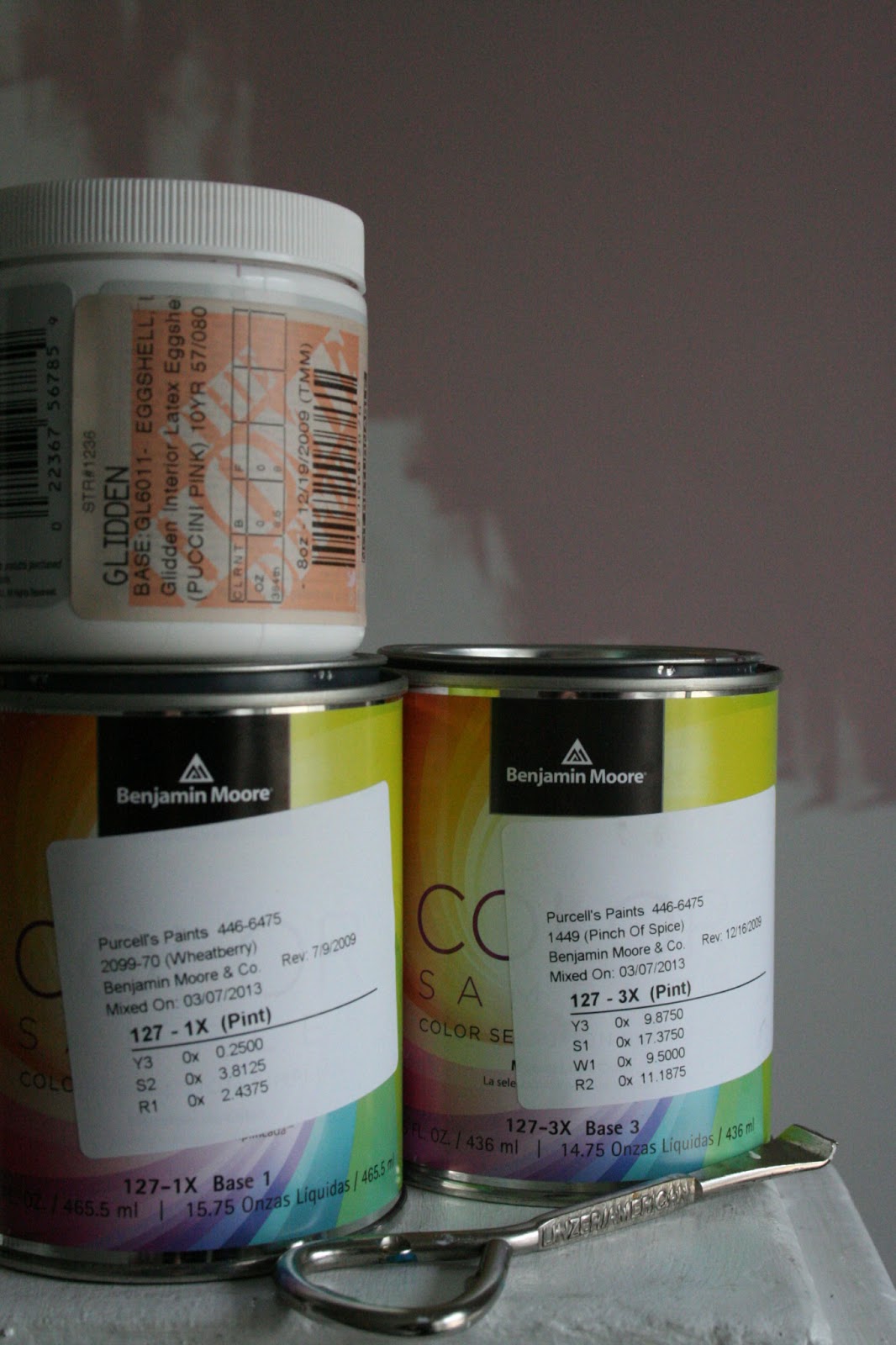

The stairway has a 2 story wall, I want something dramatic. From my handy paint magazine, I flagged several deeper purples but ended up with a recently recommended "pinch of spice", a brownish purple sample. (The white streaks are due to using the paint brush for wheatberry first.) Testing to see if it will be too dark on both sides of the stairway. Also wondering how the heck am I going to get to the ceiling to cut in.


Pink for a hallway??? Never thought about it before but the "wheatberry" sample is definitely pink. A very light pink. Another sample I picked up a few years ago, "Babe" by Glidden, a nude, deep pink. Brown, black or white pictures frames will really pop. May have to go with the lighter pink for hte hall way and the other for my bedroom. I love pink and wood accents together.


For the dining room I want intimate. The nantucket gray that I flagged in the book looked nothing like the real life chip (magazine paint swatches rarely look the same in real life.). Far to green. Although I like looking at pictures of gray rooms its very difficult to get the right one. A fine line between gloomy and moody. I picked up an inspiration folder and got the Taos taupe sample. Far more taupe then gray. A lot like the colour of West Elms Flow dinnerware series except the gray taupe is discontinued.


All four of the colours have an brownish undertone which makes them intimate and cozy and ties them together. Its kind of funny that I ended up with these samples as previous to yesterday, I was all about white, cooler gray and purple tones.


No comments:
Post a Comment